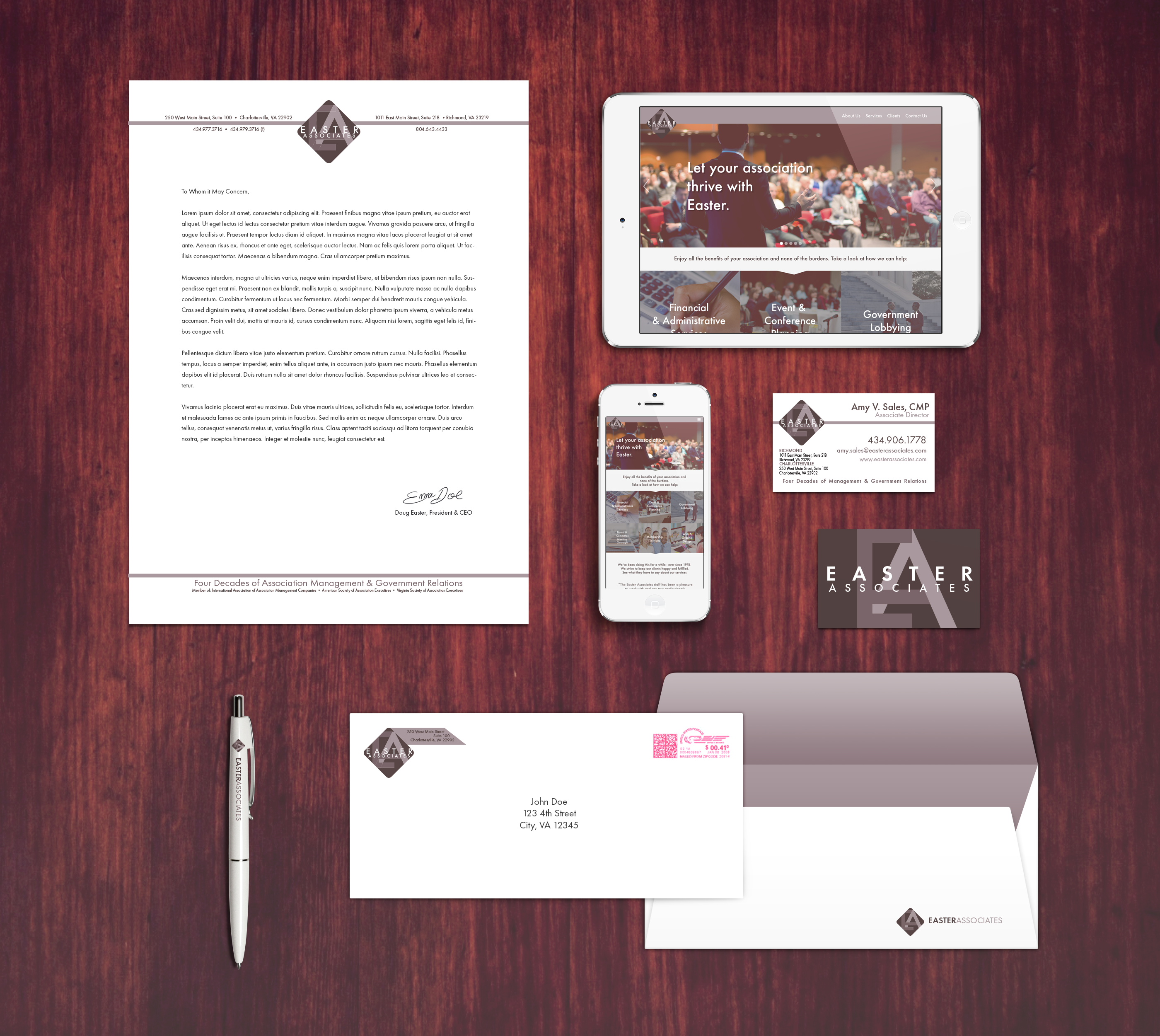
I was tasked with rebranding the company Easter Associates. Their previous logo had been in use for some time, and they felt their look was beginning to be outdated. While their previous logo was black and white, I aimed to add some color without being too overpowering. I chose a purple color to represent the ambition and drive the company has for taking care of the associations they work for. The logo went through several iterations before arriving at the final logo used today.
Project Info
- Client:Easter Associates
- Categories:Graphic Design
- Tags:easter associates, logo


